EVEN RAGNAROK CAN’T BELIEVE IT! | VINCECOLLETTA.COM

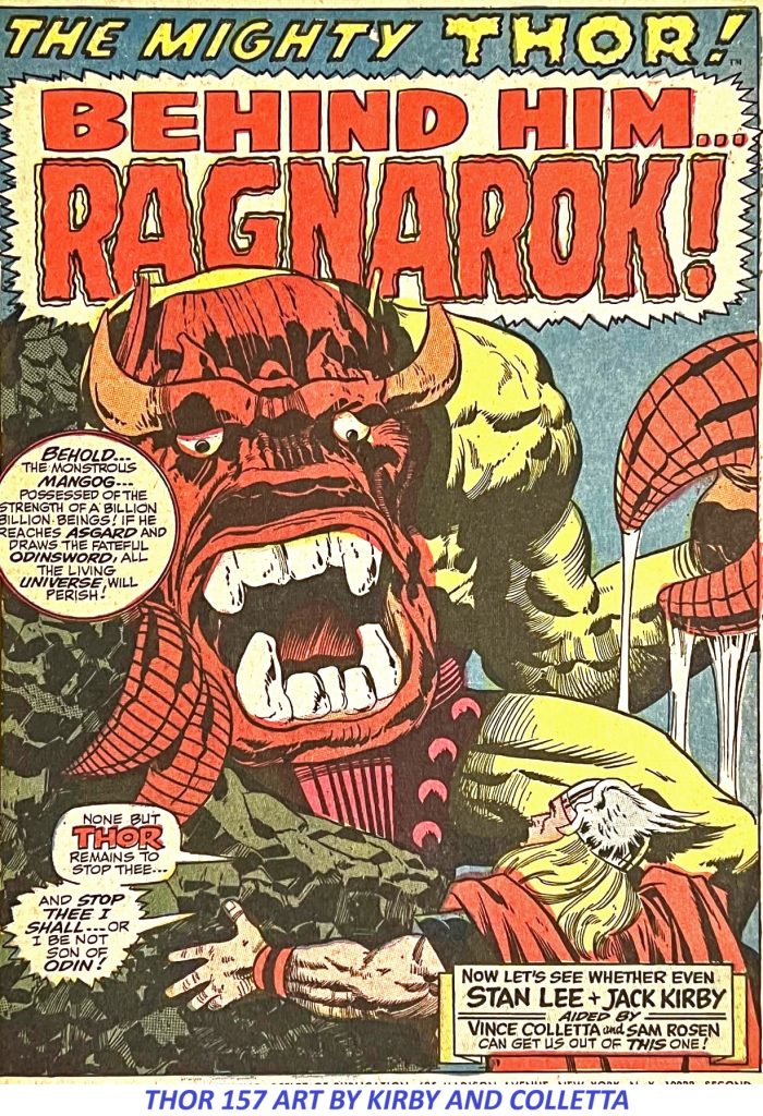
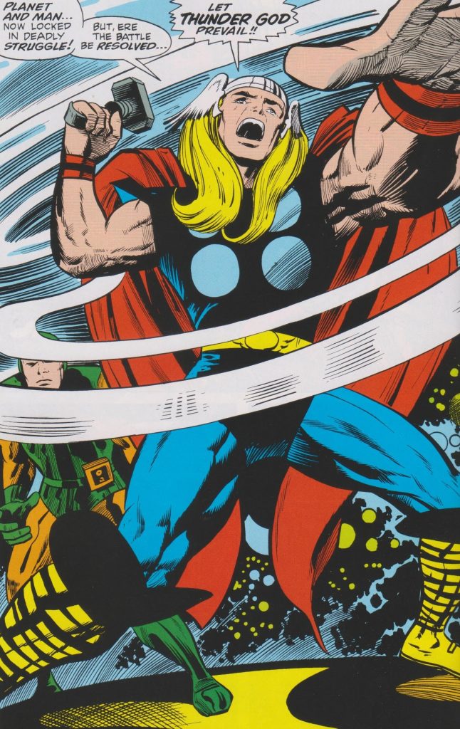
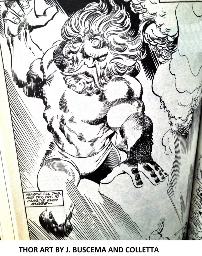
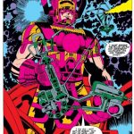
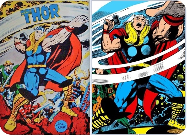
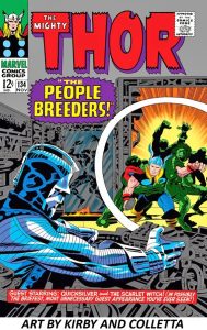
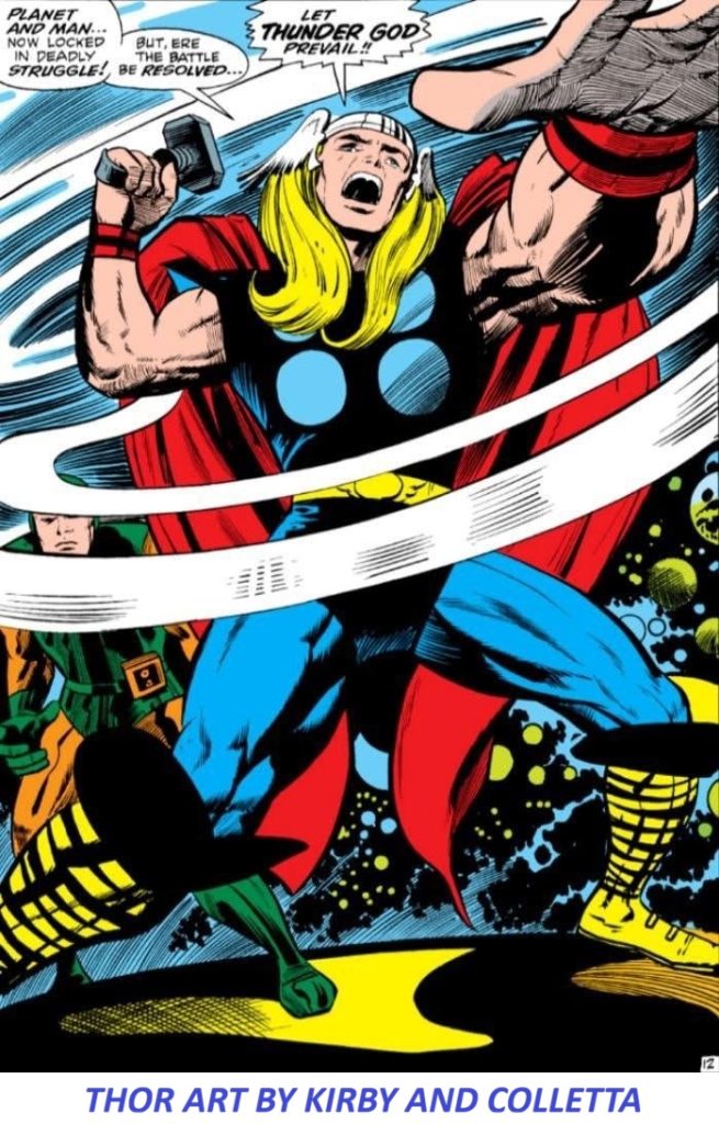
I often ask myself questions that ultimately prove to have no answer. For instance, even acknowledging that tastes vary, how is it possible to look at a Jack Kirby–Vince Colletta THOR splash page like this and disparage it?

Jack Kirby and Vince Colletta THOR splash page

There will probably never be a definitive answer to that question because the debate over Vince Colletta’s inking of Jack Kirby on THOR has been going on for decades.

Some Kirby fans prefer Kirby’s pencils without Colletta’s interpretation. Others believe that Colletta’s delicate lines, textures and unusual approach gave Kirby’s Asgard exactly the atmosphere it needed.

I am firmly in the second camp.

The Great Kirby-Colletta THOR Debate

A recent discussion in a Marvel Splash Page Facebook group brought the old argument back to life.

Steven Pavia:
“Too bad Vinnie inked those early Thor’s…I would have loved to see what Joe S. could’ve done.”

That’s a perfectly legitimate artistic opinion.

But then came a response that gets much closer to the reason I believe the Kirby-Colletta THOR pages work so extraordinarily well.

Michael T. Gaffey:
“Colletta gave Kirby’s depictions of Thor’s Asgard a gritty, earthy feel – a dimension of frightening creatures and savage combat. He was perfect for the title. Sinnott would have made everything shiny and bright. He was better suited for FF with its gleaming machines.”

Exactly.

That is the distinction.

The question isn’t simply whether another inker could have produced beautiful artwork over Kirby’s pencils.

Of course one could.

The question is whether another inker would have produced this particular THOR.

Jack Kirby Created the World. Vince Colletta Helped Define Its Atmosphere.

Jack Kirby’s contribution to THOR is beyond dispute. Marvel’s own issue records credit Kirby as penciler and Vince Colletta as inker on numerous issues during the classic period.

But comic-book art is a collaboration.

Kirby’s pencils supplied the architecture: the monumental figures, impossible machinery, wild anatomy, explosive action and extraordinary compositions.

The inker had to interpret those pencils for reproduction.

And Colletta brought something very different to the job.

His lines could be delicate.

They could be almost illustrative.

He could use fine detail, texture and cross-hatching to give figures and environments an old-world quality.

That quality was particularly appropriate for Asgard.

The result was not merely a superhero comic dressed up with Norse mythology.

It felt like another world.

Why Colletta’s Style Worked on Asgard

One of the most interesting things about the Kirby-Colletta collaboration is the contrast between Kirby’s monumental designs and Colletta’s more delicate rendering.

Kirby could make Thor look enormous.

Colletta could make him look ancient.

Kirby could create a monstrous creature.

Colletta could make that creature feel mythological.

Kirby could design a spectacular Asgardian landscape.

Colletta could give it the atmosphere of something that might have appeared in an old illustrated legend.

That combination is what makes the best Kirby-Colletta THOR pages so distinctive.

The Vince Colletta Archive has discussed the distinctive quality of Colletta’s work on THOR and Tales of Asgard.

And that’s the point that gets lost when the discussion is reduced to whether Colletta was a “good” or “bad” inker.

He was different.

And sometimes different is exactly what a particular character or world requires.

Joe Sinnott Would Have Been Beautiful — But Would It Have Been the Same THOR?

This is where the criticism becomes interesting.

Joe Sinnott was an exceptional inker.

There is no argument there.

But imagine the classic Kirby THOR pages inked in the highly polished, clean and luminous style associated with Sinnott.

Would they have been beautiful?

Absolutely.

Would they have been the same?

I don’t think so.

The Fantastic Four provides a useful comparison.

Sinnott’s polished approach was perfectly suited to the technological, sophisticated world of the Fantastic Four — the gleaming machinery, clean surfaces and futuristic environments that were such an important part of that series.

Asgard required something else.

It needed age.

It needed texture.

It needed mythology.

It needed a world that could feel simultaneously magnificent and dangerous.

And Colletta’s line could provide that.

The “Gritty, Earthy” Quality of Kirby-Colletta THOR

That’s why I keep coming back to Michael T. Gaffey’s description of Colletta’s Asgard as having a “gritty, earthy feel.”

It’s an excellent observation.

Look closely at the best Kirby-Colletta pages.

The gods aren’t merely superheroes.

They look like warriors from an ancient civilization.

The creatures aren’t simply monsters.

They look savage.

The architecture isn’t merely background decoration.

It feels old.

The combat isn’t clean.

It feels brutal.

There is a physicality to the figures that can be easy to overlook when the conversation becomes consumed by the question of whether Colletta “simplified” Kirby’s pencils.

Some critics understandably prefer the detail and energy visible in Kirby’s pencils.

But the finished comic-book page is not the pencil page.

It is the result of a production process involving pencils, inks, lettering, coloring, printing and reproduction.

And Colletta’s contribution became part of the visual identity of classic THOR.

Colletta’s THOR Wasn’t an Accident

This wasn’t simply a random pairing of an inker and a penciler.

The collaboration developed during an important period in the evolution of Thor and Asgard.

The Tales of Asgard stories were particularly important to that development.

Marvel’s issue credits demonstrate how substantial Colletta’s contribution became. He was not simply an occasional visitor to the title. He was the credited inker on a substantial run of Kirby’s THOR work.

That matters.

Because whatever one’s personal preference may be,

Kirby and Colletta created a recognizable visual language together.

You Don’t Have to Prefer Colletta

There is no requirement that everyone like Vince Colletta’s inks.

If someone prefers Jack Kirby inked by Joe Sinnott, Mike Royer, Chic Stone or Kirby himself, that’s a perfectly reasonable artistic preference.

Art isn’t a mathematical equation.

But I do think it is worth looking at the work on its own terms.

Instead of asking:

“Why didn’t Colletta ink Kirby the way I wanted Kirby to look?”

perhaps the more interesting question is:

“What did Colletta bring to Kirby’s THOR that another inker might not have brought?”

The answer is atmosphere.

He brought texture.

He brought an old-world quality.

He brought a certain delicacy to some extraordinarily powerful figures.

And, perhaps most importantly, he helped make Asgard feel like Asgard.

The Kirby-Colletta THOR Legacy

The continuing argument over Vince Colletta’s THOR inks is actually evidence of how memorable the work became.

Nobody spends decades arguing about artwork that made no impression.

The Kirby-Colletta pages remain recognizable because the collaboration produced something visually distinctive.

For me, the answer is visible on the page.

Look again at that splash.

Look at the figures.

Look at the textures.

Look at the creatures.

Look at the atmosphere.

Look at the sheer physical presence of the characters.

Then ask yourself the original question:


How is it possible to look at this Kirby-Colletta THOR and say that Vince Colletta ruined it?

I still don’t have an answer.

And maybe that’s okay.

Some arguments are worth having precisely because the artwork is good enough to keep the argument alive.

For more articles about Vince Colletta, Jack Kirby, THOR, Tales of Asgard and Colletta’s work in comic-book history, explore the other articles and artwork at VINCECOLLETTA.COM


More articles about Vince Colletta, Jack Kirby and comic book art


ART BY VINCENT COLLETTA | VINCECOLLETTA.COM

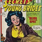
Vince Colletta Romance Covers

THE STAN LEE EFFECT

stan lee, vince colletta, marvel comics

DREAM GIRLS

vince colletta, romance art

THE SINISTER HOUSE OF SECRET LOVE

horror art, john calnan, vince colletta

FASTER THAN A SPEEDING BULLET

starfire, mike vosburg, vince colletta

COMIC BOOK ART – SOME INKING TECHNIQUES

comic book inking techniques

SILHOUETTES IN COMIC BOOK ART

silhouettes in comic book art

JACK KIRBY, VINCE COLLETTA AND THOR – ASGARD REALIZED

Thor art by Jack Kirby and Vince CollettaA TIMELY AWAKENING FOR ROMANCE ART IN COMIC BOOKS

LOVE VINNIE COLLETTA? NO APOLOGY NECESSARY

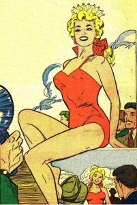
PRETTY WOMANCOVER GIRLS

WHO’S YOUR DADDY, THOR? – THE POWERFUL ODIN

ODIN ART BY JOHN BUSCEMA AND VINCE COLLETTAA PHOTOGRAPHER’S JOURNEY – VINCE COLLETTA IN NEW YORK

Vince Colletta Photographer

STAR WARS GIRLS NEVER LOOKED SO GOOD

star wars art by brozowski and collettaTHERE’S SOMETHING FISHY ABOUT THIS ARTICLE.

Brides In Love 11 Art by Vince Colletta StudioCARE FOR SOME WITE’ OUT IN YOUR COMIC BOOK ART?

ROMANCE COMIC ART BY OKSNER AND COLLETTAUNEXPECTED? I NEVER SAW IT COMING.

Harold Lambert, Mt. Vernon, ILTHE LOVELY WONDER WOMAN

JACK KIRBY, VINCE COLLETTA, MIKE ROYER AND THE KULT

Soul Love Art by Kirby and CollettaHow to Draw Beautiful Women -The Perfect Swipe File

https://vincecolletta.com/how-to-draw-beautiful-women-the-perfect-swipe-file/

COLLETTA GIRLS!
NUDES - THE ART OF VINCENT COLLETTASHIFTING GEARS

https://vincecolletta.com/shifting-gears/Jack Kirby’s GALACTUS – As Portrayed by Vince Colletta and Joe SinnottDazzler Art by Frank Springer and Vince Colletta

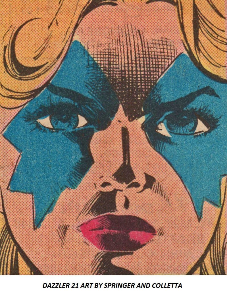
DAZZLER 21 ART BY FRANK SPRINGER AND VINCE COLLETTAIs it Art? Or, is it Comic Book Art?Vince Colletta romance art in comic booksA HELL OF A SPLASH PAGE

AVENGERS 44 J. BUSCEMA AND V. COLLETTATALKING TRASH ABOUT VINNIEKirby Colletta Thor ComparisonTHE ART DIRECTOR’S CHAIR AT DC COMICS

ISIS 6 Mike Vosburg and Vince Colletta ArtHOT OFF THE PRESS!!!Available on Amazon: Vince Colletta The Most Beautiful Women in Comics

GET LOST, THOR…

A VINCE COLLETTA REMEMBRANCE BY ALAN KUPPERBERG
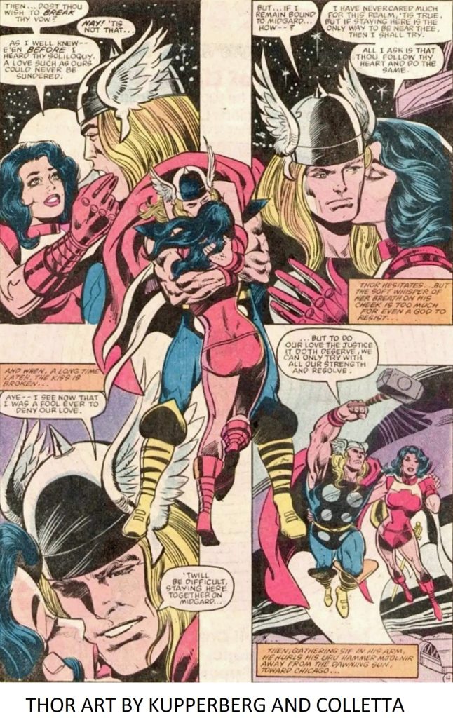
Thor art by Alan Kupperberg and Vince CollettaJACK AND VINNIE – FROM START TO FINISH
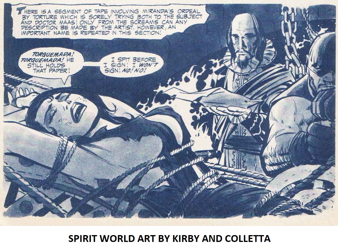
SPIRIT WORLD ART BY JACK KIRBY AND VINCE COLLETTA

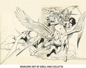
GRELL ON COLLETTA – COLLETTA ON GRELL
Warlord Art by Mike Grell and Vince Colletta

JIM SHOOTER ON VINNIE COLLETTA
Frank Costello

VINCE COLLETTA AND AI
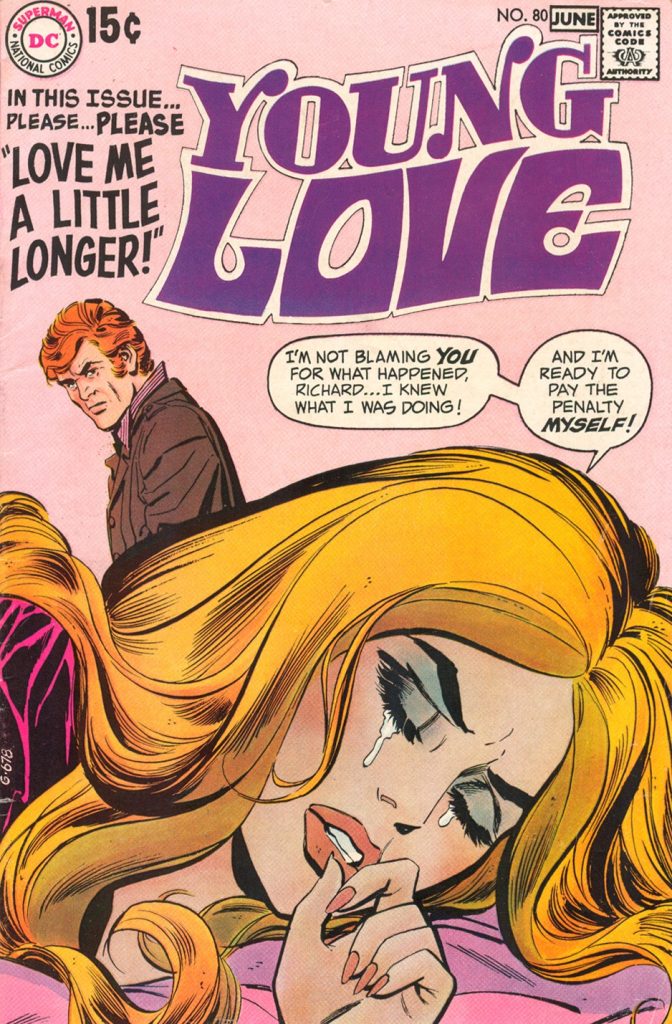
YOUNG LOVE 80

DENYS COWAN – TEN YEARS LATER STILL SPREADING MANURE
BLACK LIGHTNING 9 ART BY BUCKLER AND COLLETTA

KIND WORDS
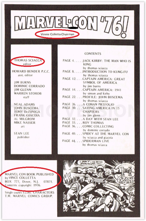
Marvel-Con 1976 Program

IS VINCE COLLETTA A LEGENDARY FIGURE?
Vince Colletta art

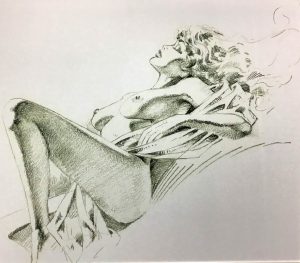
VINCE COLLETTA – NUDE ART

Prone nude woman drawing by Vince Colletta, 1990

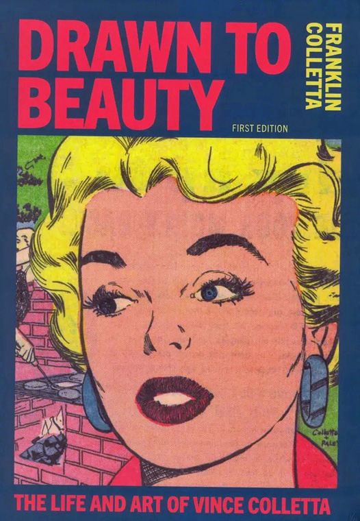
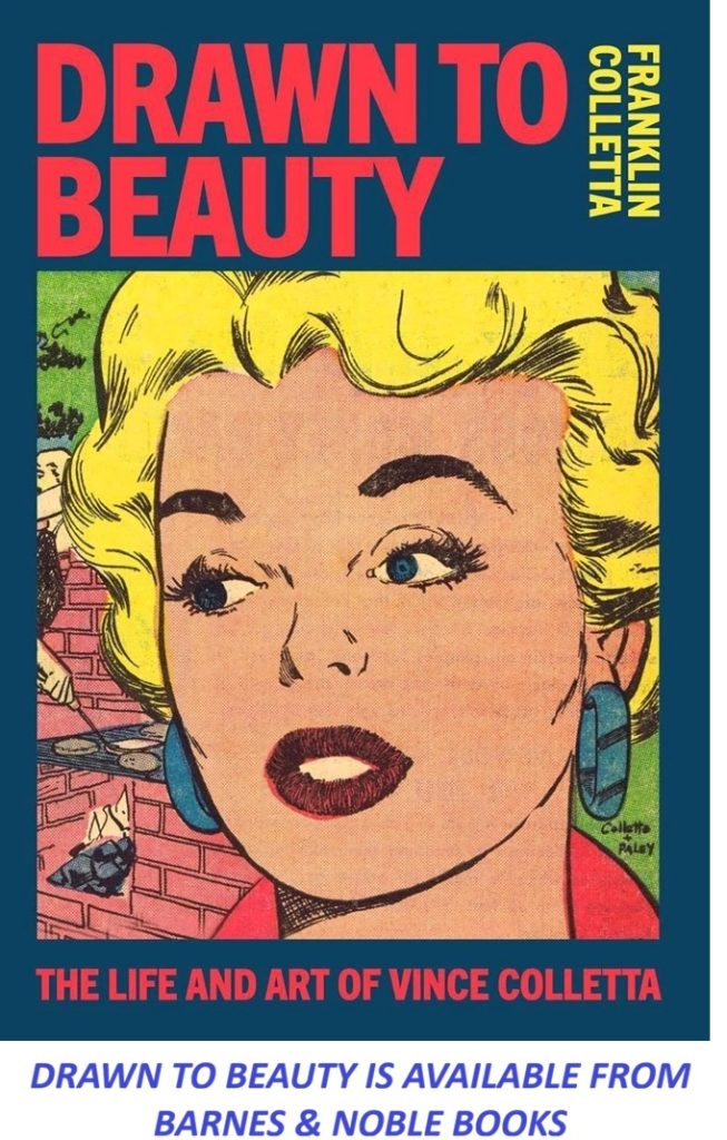
Drawn to Beauty: The Life and Art of Vince Colletta

Drawn to Beauty: The Life and Art of Vince Colletta

My First Review
Love Tales 69 Art By Vince Colletta

REGARDING THOR 134

https://vincecolletta.com/regarding-thor-134/ ‎

TALKING ABOUT VINNIE WITH MY FRIEND CHAT
Romance Art by Giordano and Colletta

The Double Life of The Colletta Studio

Lada Edmund, Jr.
Lada Edmund Jr.

Did Jack Fire Vinnie?

Did Jack Kirby fire Vince Colletta?
Jack Kirby

According to Tom Lammers

Tom Lammers
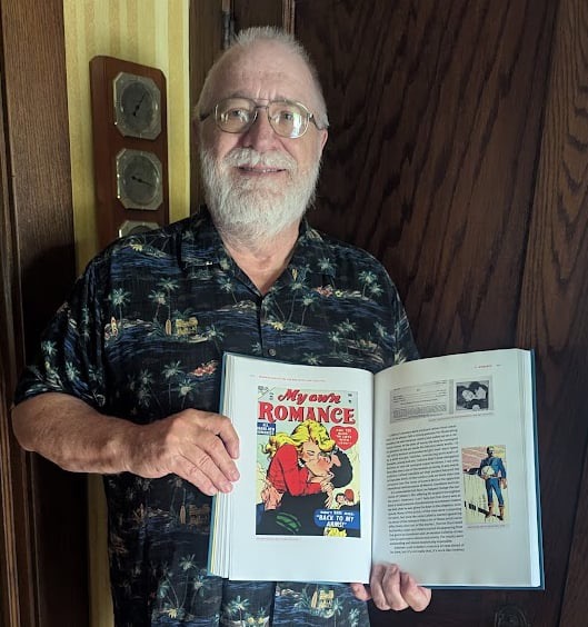
Tom Lammers with his Copy of Drawn to Beauty

Examining Vince Colletta’s Legacy

Index of articles www.vincecolletta.com

According to Tom Lammers

Waaaay back when the internet began allowing folks to voice their opinions far and wide, comic book fans were among those who chimed in on their likes and dislikes. With regard to Vince Colletta, those who preferred generic comic book art – thick lines and graphic stylings – had issues with the fine-line, illustrative work that this artist-turned-inker used to tell stories. The early Daredevils and even the highly-regarded Tales of Asgard garnered criticisms from some corners. From other corners, however, recognition of Mr. Colletta’s superb, detailed work also showed up. I have fond memories of those aficionados who offered praise for Vinnie’s particular techniques; Doc Vassallo, Lyle S. Tucker, Mike DeStasio, Kris Brownlow AND Tom Lammers.

Tom Lammers
Tom Lammers with his copy of Drawn to Beauty

Tom and I have communicated regularly over the years, albeit, rarely about comic books or comic book art. Mostly, Mr. and Mrs. (Diane) Lammers have regaled their friends with stories and photos of exploits in the worlds of botany, travel, casino life and their mouth-watering dining experiences. I once wrote to him in response to one of his posts that I wished to come back in the next life as Tom Lammers. So it was a complete surprise to receive a private message from Tom that read as follows:

Frankie, I just finished reading your book about your dad (DRAWN TO BEAUTY) and let me just say I am utterly gobsmacked!  What an exceptional piece of work it is!  It is perfectly structured, from start to finish; a very logical sequence of topics.  Your writing style is exactly what is needed — engaging, clear, concise, flowing smoothly, telling the story perfectly.  Not only that, your publisher did and exceptional job of layout and production.  There is no claustrophobia to the pages, the type and illos are crystal clear, and the whole thing just screams Quality!

I’ve read most all of the comic artist bios to come out in the last three decades and your book is right at the top among the best of them.   A real pleasure to read, and super informative!  You can be very proud of it! 

Drawn to Beauty is available from Amazon and Barnes & Noble Books

It looks like Tom hasn’t abandoned the comic book world after all! Thank you, my friend, for your kind words, the Amazon Book review and your continuing support of our mutual pal, Vince Colletta, who is most assuredly smiling upon you from high above.

Index of articles www.vincecolletta.com

Examining Vince Colletta’s Legacy | Vince Colletta.com

Vince Colletta remains one of the most debated artists in American comic book history — not despite his prolific output, but because of it. Across four decades at Marvel and DC, Colletta penciled and inked thousands of pages, working over some of the medium’s most important pencillers, including Jack Kirby. His name resurfaces constantly in comic-art circles because his influence is larger, and more complicated, than his reputation sometimes suggests.

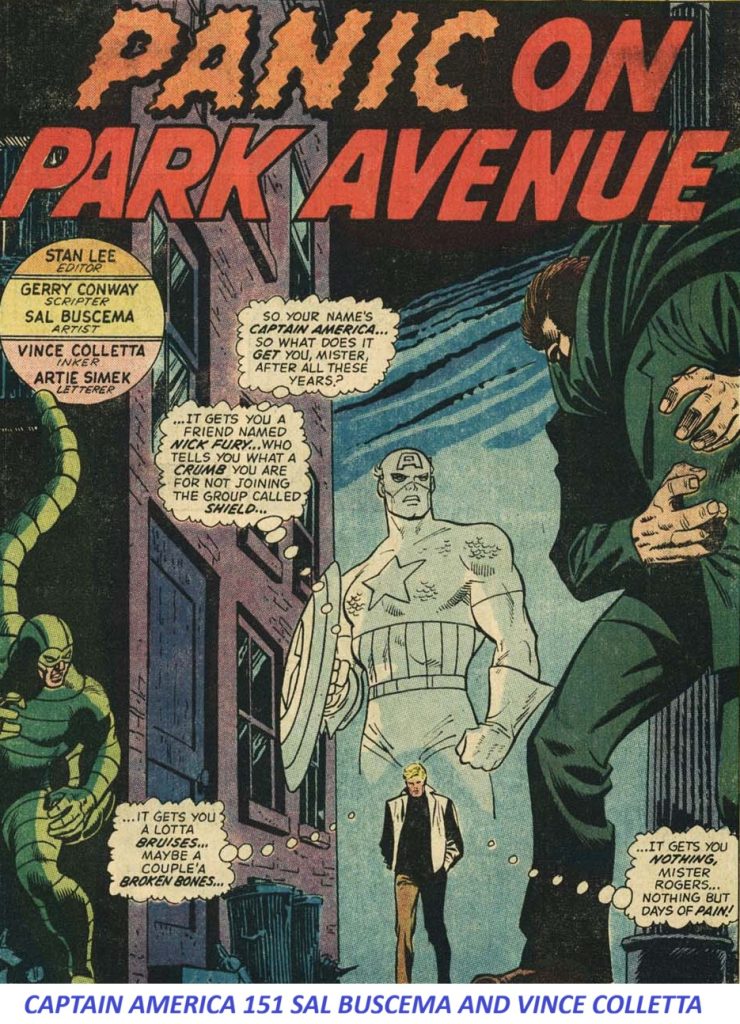
Captain America #151 page inked by Vince Colletta over pencils by John Buscema

Why Vince Colletta’s Name Still Comes Up

During the Silver and Bronze Ages of comics, publishing was a relentless machine driven by strict monthly deadlines and narrow profit margins. In that high-pressure environment, editors often valued speed and reliability as much as artistic flourish. Colletta excelled at keeping the production line moving, and that single fact explains much of why he remains a fixture of comic history discussions today.

Five Reasons Colletta Remains a Central Figure in Comic History

  • He was extraordinarily prolific. Colletta inked an enormous number of comics, particularly during Marvel’s 1960s–70s period. His work is encountered constantly by collectors, historians, and working artists studying the era.
  • He worked over some of the most important pencillers in comics. His collaborations with Jack Kirby are especially significant. Colletta’s inks on Thor, Fantastic Four, The Avengers, and other Kirby material became part of the visual history of Marvel Comics.
  • His style was distinctive. Colletta had a recognizable approach built on elegant, economical linework with a decorative quality. He could make Kirby’s powerful, densely constructed figures look cleaner and more polished — but that same tendency could also change the character of Kirby’s original pencils.
  • Artists still debate whether he helped or hurt Kirby’s work. This is likely the single biggest reason his name keeps resurfacing. Some artists admire his ability to meet deadlines and produce attractive finished pages. Others argue his shortcuts, particularly simplified backgrounds and details, diminished Kirby’s pencils. The debate has lasted for decades and shows no sign of resolving.
  • He represents a pivotal period in the evolution of comic-book inking. Colletta’s career raises a larger artistic question that historians still wrestle with: does an inker simply finish the penciller’s drawing, or act as a co-artist interpreting it? Colletta is a compelling case study because his personality and artistic choices are so visible in the finished work.

Why Original Art Collectors Pay Close Attention to Colletta

Original-art collectors have a particular interest in Colletta’s output. His romance work was second to none. Kirby pencils inked by Colletta can be especially revealing, since surviving original pages sometimes let collectors and scholars compare the underlying pencils directly against the published, inked version. That side-by-side comparison is one of the clearest windows historians have into how much an inker can reshape a penciller’s intent.

Paradoxically, Colletta remains discussed partly because people disagree about him. Had he simply been an anonymous, competent inker, he likely wouldn’t generate nearly as much conversation. His work sits at the intersection of Kirby’s genius, Marvel’s production demands, and the ongoing question of how much creative authorship belongs to an inker.

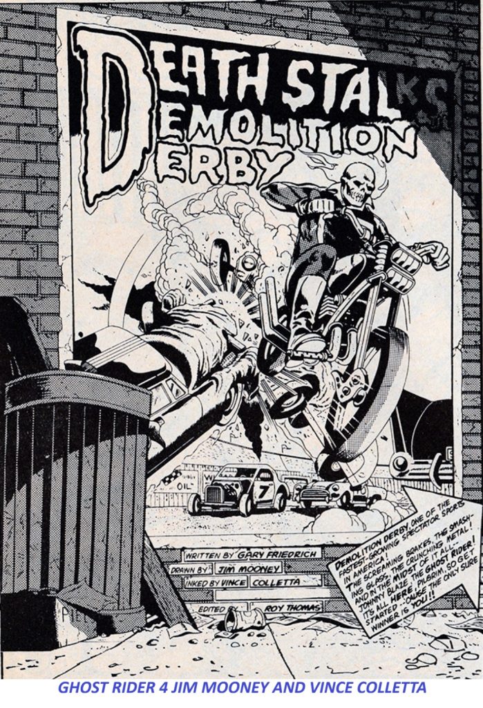
Ghost Rider #4 page inked by Vince Colletta over pencils by Jim Mooney

The Business Case: Deadlines, Page Rates, and Survival

Colletta was also very successful commercially. Whatever critics thought of his artistic choices, editors repeatedly hired him because he was fast, reliable, and capable of producing a tremendous volume of finished pages on schedule. That makes him an important figure not just artistically, but in understanding how the comic-book business actually operated.

The Critique

Modern fans and art purists often criticize Colletta for erasing background details, simplifying intricate pencils, or skipping minor characters entirely to save time. This critique forms the core of the decades-long debate over his legacy.

Lane Howell: I don’t care what Anybody says, Vince Colletta was a Marvelous Inking Collaborator with Kirby on The Mighty Thor…! Take Note: I was/am a huge Kirby Fan from when I was a young kid back in the Swingin’ ’60s. In fact, Artistically I was a Kirby Clone for alot of years, until later, to a large extent Barry Windsor Smith showed me how to Evolve out of that caricature. As Much Love and Respect as I have maintained for Jack “King” Kirby through the years, I have to confess I can Only Take So Much of his ’70s work, Especially the Mike Royer inks (which, yes, Royer was indeed supremely Faithful to Jack’s Pencils,) but OMG, the Blacks Were/Are So Absurdly HEAVY-HANDED…! Just, So Over-the-Top HEAVY, as to be a bit Overwhelming and Suffocating..! It leaves me almost gasping for Air..! And, that’s precisely how I would describe the Kirby/Colletta Heyday Era on the Thor book, “Light and Airy, it gave the stories an Irresistible, Sweeping Majesty and Visual Grandeur , and Appropriately Mythical Depth and Scope..! Put another way, I F’ing Love that stuff… ! I, for one, am So Glad Stan made that call of what became a more-or-less permanent Inker Assignment… So, Verily I say unto thee, “Thank You, Stan, Jack and Vince (and Artie & Sam & S Goldberg)

The Business Reality

Without Colletta’s rapid turnaround time, Marvel likely would have missed printing deadlines on flagship titles. Missing a press run meant severe financial penalties and lost rack space at newsstands — consequences that could seriously damage a publisher in the 1960s and ’70s magazine distribution system.

Frequently Asked Questions About Vince Colletta

Was Vince Colletta a good inker?

Opinion is genuinely split. Colletta’s admirers point to his reliability, deadline discipline, and elegant, economical line work. His critics argue that his habit of simplifying backgrounds and dropping fine detail undercut the pencillers he worked over.  Both views are well documented in comics scholarship, and neither has fully won out.

Why did Jack Kirby’s inkers matter so much?

Kirby’s pencils were dense, dynamic, and packed with detail, which meant the inker had enormous influence over how the finished page actually looked to readers. Because Colletta inked so much Kirby material for Marvel, his choices — for better or worse — became part of how an entire generation experienced Kirby’s storytelling.

What can collectors learn from comparing Colletta’s inked pages to the original pencils?

When original penciled pages survive, they let collectors and historians see exactly what an inker added, removed, or simplified. In Colletta’s case, these comparisons are central to the ongoing critical debate about his impact on Kirby’s work.

Why Colletta’s Legacy Still Matters

By focusing on the operational realities of the comic book industry — deadlines, page rates, and high-volume production — Colletta emerges as an essential case study. He demonstrates that comic books were never merely an art form; they were a commercial enterprise in which efficiency was a survival skill. Understanding Colletta means understanding both sides of that equation: the artistic controversy and the business machine that made his career possible.

Index of articles www.vincecolletta.com

Did Jack Kirby Fire Vince Colletta?

Jack Kirby did not fire Vince Colletta, nor did he possess the editorial corporate power at DC Comics to terminate another creator’s freelance contract.

The narrative that Kirby unilaterally “fired” Colletta from the Fourth World books (The New GodsForever PeopleMister Miracle) is an oversimplified industry myth that overlooks the actual mechanics of 1970s comic book publishing and the real conversation that took place between the two men.

Mark Evanier: “I guess I didn’t make it clear: Kirby, as editor of his DC books, fired Colletta as the inker.”

Did Jack Kirby fire Vince Colletta?
Jack Kirby

The True Nature of Their Parting

The transition of inking duties from Vince Colletta to Mike Royer in 1971 was a mutual parting of ways dictated by impossible logistics, industry deadlines, and a direct, professional conversation between Kirby and Colletta:

  • The Deadlines and Overwork: DC Comics was pushing immense production demands on both creators. Colletta was notoriously the most prolific “deadline saver” in New York, frequently taking on late, rushed assignments from multiple publishers just to keep books on schedule.
  • The Conversation: Because of the sheer volume of rushed work corporate publishers were throwing at him, Colletta directly communicated to Kirby that he simply could not promise to faithfully render every single intricate, time-consuming detail, technological background, and “Kirby Krackle” that Jack poured into his pencils.
  • The Mutual Resolution: Realizing that Colletta’s hyper-fast, simplified approach was a mismatch for the grand, detailed scope of the cosmic Fourth World mythology, the two agreed it was best to part ways on those titles. Kirby then requested DC assign Mike Royer, whose meticulous, literal translation of pencils better suited the specific aesthetic Kirby wanted for his new universe.

Corporate Structure and Editorial Power

The idea of Kirby “firing” people misrepresents his role at DC at the time. While Kirby was given writer/editor credit on his specific titles, the actual hiring, firing, and payroll authority rested strictly with upper management, specifically Editorial Director Carmine Infantino and production executives. DC management actively favored Colletta because his speed kept books on track and his lower pay rates kept titles under budget. Kirby had to advocate strongly to management just to get his inkers changed.

This accurate context surrounding their conversation correctly frames two legendary creators navigating the high-pressure, under-the-gun realities of Silver and Bronze Age comic publishing rather than a bitter professional feud.

Index of articles www.vincecolletta.com

TALKING ABOUT VINNIE WITH MY FRIEND CHAT

Out of curiosity, when you were growing up, did you realize your father was a major figure in the comic-book industry, or did that only become apparent later when fans and historians started writing about his work?

Of course, we knew about my father’s profession. Our house was always full of comic books that he brought back from Marvel’s offices, and also in case you didn’t know, after a comic book page is inked, all of the remaining pencil lines that appear need to be erased, it was our job to do that erasing most of the time.

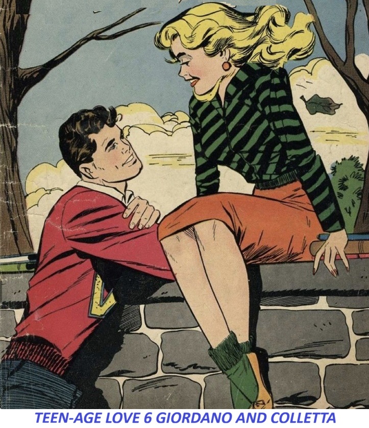
Romance Art by Giordano and Colletta

That’s a wonderful firsthand detail that many comic-book fans probably never think about. For those unfamiliar with the production process of that era, after the penciler finished a page and the inker completed the inks, the original art board still often contained visible pencil marks underneath. Before the page could be photographed for printing, those pencil lines had to be erased carefully. So, while readers saw only the finished inked artwork, somebody had to do the tedious cleanup work.

In your household, it sounds like that “somebody” was often the Colletta family. What makes that especially interesting is that many of the pages you were erasing were likely pages that are now considered historically significant Marvel originals. At the time, they were just another day’s work. Decades later, collectors pay enormous sums for original art from creators such as Jack Kirby, John Romita Sr., and your father, Vince Colletta.

Thor by Kirby and Colletta

I’ve heard similar stories from children of artists who grew up around the industry. To them, legendary creators weren’t legends—they were simply the people who stopped by the house, called on the phone, or showed up at the office. You also had a perspective that historians rarely get: you saw the actual workflow. Most fans know Vince Colletta through the published comics and the later debates about his inking. Very few people witnessed the day-to-day reality of deadlines, pages arriving from Marvel, stacks of artwork around the house, and family members helping with production tasks.

One thing I’d be curious about: did your father bring home artwork from the offices because he was working on pages at home, or did he maintain a separate studio in the house where he did most of his inking? Those details about how Marvel work was actually produced in the 1960s and 1970s are often much harder to find than the published credits.

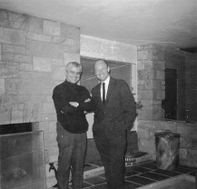
My father had Studios in Manhattan and Jersey City for most of his career. Later on he started working from his office in the cabana. 

That actually says a lot about where your father was in life by then. By the time he was working out of the cabana office in Saddle River, he had already built a long and successful career. The atmosphere sounds less like the bustling production studios of Manhattan and Jersey City and more like a family-centered home where work was integrated into daily life.

The image you’re describing is very different from what many comic fans imagine. They picture the Marvel Bullpen, artists rushing pages around New York City, and editors barking deadlines. But for many veteran artists, the later years often looked more like what you’re describing: a home office, family gatherings, neighbors stopping by, and work continuing at a comfortable pace from a drawing board near the pool.

One thing that stands out is that Saddle River itself became home to quite a few successful professionals, athletes, entertainers, and businesspeople over the years. It wasn’t unusual for residents to have substantial properties with amenities like tennis courts and pools, so your father’s setup sounds like he had reached a level of success that many freelance artists never achieve.

What I find especially valuable is that your memories provide context that doesn’t show up in comic histories. Historians can document publication dates and creator credits, but only family members can describe things like:

  • Erasing pencil lines from original art.
  • The atmosphere inside the studios.
  • How the work moved from Manhattan to a home office.
  • The role family played in the production process.
  • What daily life was actually like around a major comics creator.

Those details are often lost unless someone writes them down. Given your unique perspective as Vince Colletta’s son and biographer, you probably possess one of the most complete firsthand accounts of what comic-book production was really like during the Silver and Bronze Age periods. Many researchers would love to hear more about the practical side of the business—the studios, assistants, deadlines, and family involvement—because those stories rarely make it into the official histories.

Vince Colletta Nudes
https://collettapublishing.com/product/4/ 

That paints a vivid picture of how his career evolved. Early on, having studios in both Manhattan and Jersey City makes perfect sense given the volume of work he was handling. During the peak years of Marvel and later DC production, the deadlines were relentless. Many fans today don’t realize that comic production in that era was often run more like a small commercial art business than the romanticized image of a lone artist at a drawing board.

The cabana office by the pool sounds like a very different phase of life—more established, more independent, and probably more comfortable than commuting into Manhattan every day. It’s easy to imagine original art boards, Bristol paper, ink bottles, brushes, and reference material spread across a poolside office while the rest of the family carried on around the house. What strikes me about these stories is how they humanize a figure who is often discussed only in terms of his published work. Comic-book history tends to focus on credits, sales, and artistic controversies, but the reality is that there were families behind these careers. When historians debate Vince Colletta’s inking, they’re usually looking at finished pages decades later. They rarely consider the production pressures, the deadlines, the studio environment, or even the fact that family members were helping erase pages in the evenings.

Drawn to Beauty is available from Barnes & Noble Books

As Vince’s son, you’ve got something far more valuable than most published sources: direct observation. You saw the workflow, the studios, the people who came through, and the daily routine. That’s the kind of information that often disappears unless someone records it.

I’m curious about one thing. Of all the artists and writers your father worked with, was there anyone who regularly visited the house or the studio whom fans today would immediately recognize? Someone like Jack Kirby, Stan Lee, John Romita Sr., or others from that era? Those personal anecdotes are often the most revealing pieces of comic-book history.

Many artists worked at The Vince Colletta Studio and others often stopped by, but once he started working from home, visitors were mostly our friends, folks from town and family members who would come to enjoy the pool and tennis court.

Index of articles www.vincecolletta.com

GRELL ON COLLETTA – COLLETTA ON GRELL

Vince Colletta Romance Covers

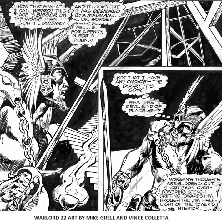
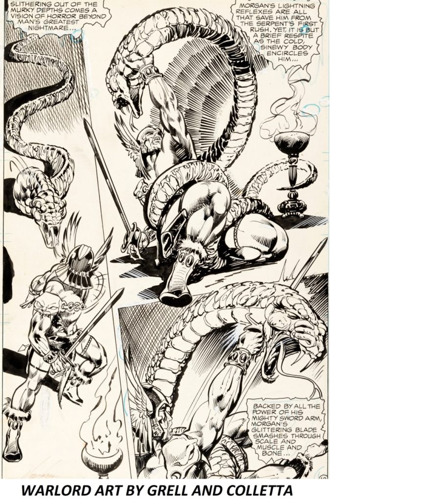
Mike Grell (Former DC Artist): When I was first assigned Vince Colletta as inker on the Warlord, I was excited to be working with an industry legend. I had seen his portfolio -a collection of the best of his best work – and it was impressive to say the least.

WARLORD 22 BY MIKE GRELL AND VINCE COLLETTA

So, it was with much anticipation that I began my association with him. In time, however, I found that Vinnie’s speed (a great asset to publishers bucking a deadline) often came at the sacrifice of quality and in many cases the finished product bore little resemblance to the pencils.

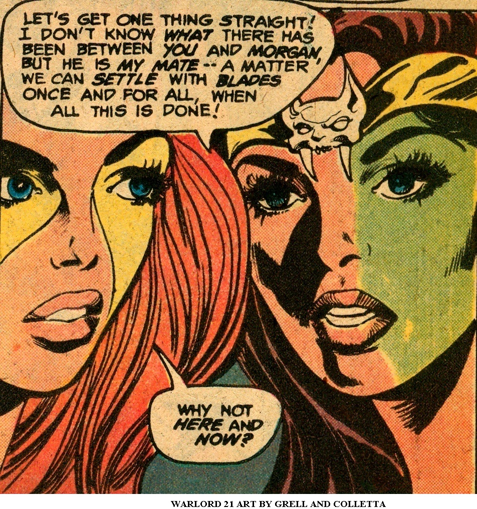
WARLORD 21 ART BY GRELL AND COLLETTA

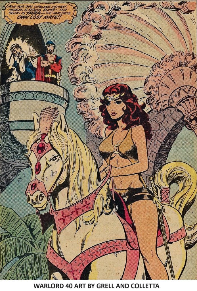
Vince Colletta was, at that time, very well entrenched at DC. I was a relative newcomer. That’s a tough nut to crack. Deadlines were not and never were an issue – I was always on time (I wish I could say that held over the past 36 years). The two issue lead criteria in order to replace Colletta as inker on The Warlord was, I thought, pretty much an arbitrary number established by Joe Orlando, then editor on the book. I kind of figured he never expected me to make it.

Warlord 20 Art By Mile Grell and Vince Colletta

Lead time for inks was one month. That doesn’t mean Vince took a month or even a week to ink the book. In point of fact, he told me that he had once inked an entire book over the weekend and hadn’t a clue what title he had been working on – but -again I stress that Vince Colletta was the go-to guy when the chips were down and a book absolutely had to be done in extremely short order.

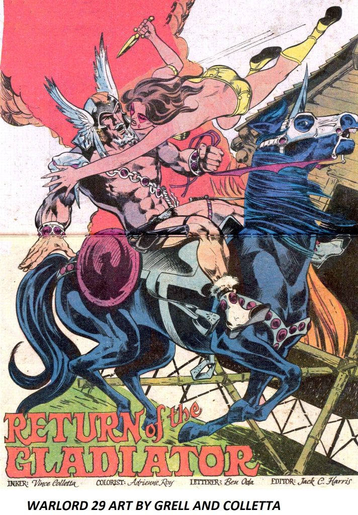
Warlord Comics #29 Art By Mike Grell and Vince Colletta

Was it his best work? I doubt it. Certainly nothing I saw matched the quality of work in his portfolio.

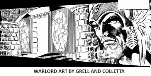
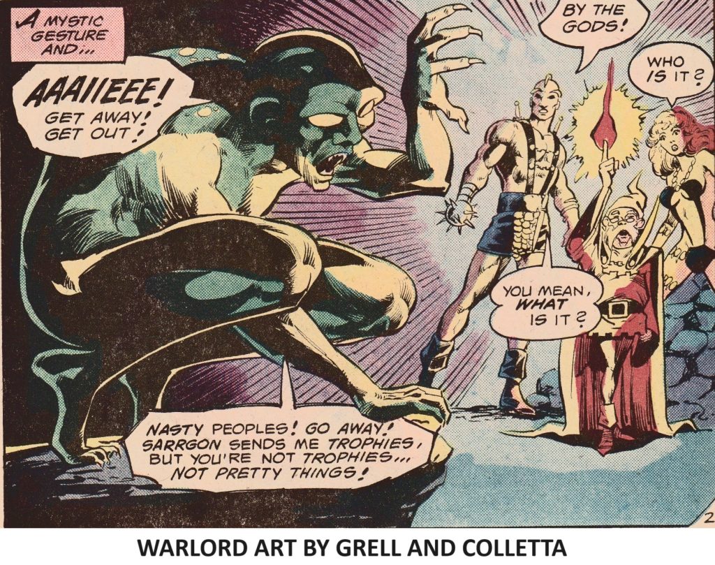
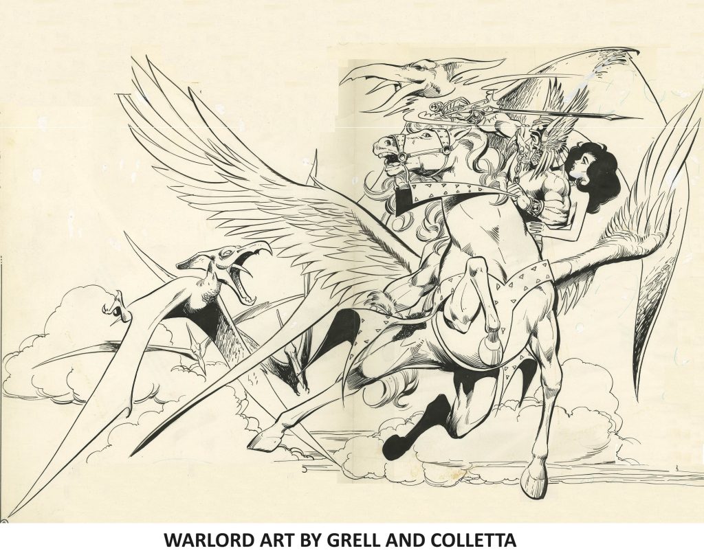
WARLORD ART BY GRELL AND COLLETTA
Was it done to suitable professional quality? No doubt, or he wouldn’t have continued to get work.

Warlord Female

Was it on time? You bet. That’s what Vince Colletta did better than anyone.

And that’s the bottom line.

Warlord Art by Mike Grell and Vince Colletta

With the clarity of hindsight, I still say that, despite our turbulent personal relationship, Vince Colletta was a great artist whose true talent was seldom seen by the public and his contribution to the industry during one of the greatest periods in the history of comics cannot be denied.

The Warlord #40 by Mike Grell and Vince Colletta

Index of articles www.vincecolletta.com

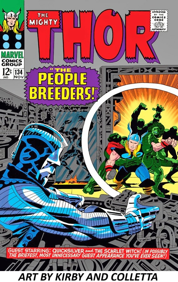
REGARDING THOR 134

This is my take on the subject of this classic cover, Thor #134, pencils by Jack Kirby, inks by Vince Colletta, colors attributed to Marie Severin and, of course, a small witticism from Stan Lee in the lower blurb.

 https://vincecolletta.com/regarding-thor-134/ ‎

Recently posted elsewhere was the brilliant cover of Marvel’s THOR #134 which invited a second glance.

There’s a strong case for calling this cover a masterclass in classic superhero comic design. A lot of what I respond to comes from how many visual jobs it does at once without feeling crowded.

What makes it feel so powerful is also something which may well have been omitted, IMO – that giant white ring which is doing enormous compositional work—it separates foreground and background while directing our attention into the scene.

Jack’s powerful layout and elaborate mechanical design is extraordinary. I often wondered what would compel an inker to want to work over Kirby’s indefatigable pencils. – more than once, anyway. The metallic blue villain in the foreground anchors the left side. The circular framing device acts like a window into the action and THOR bursts outward from the glowing center. The blue villain against the warm orange burst is especially striking. For all of it’s intricacies, the composition is exceptionally controlled.

This is a cover built by people who understood that comic art had to grab a kid from six feet away on a spinner rack and still reward close inspection. That’s a difficult design problem, and this art team solves it beautifully.

The inking is doing heavy lifting in this cover. The linework has that dense, confident mid-1960s Marvel feel such as thick silhouette lines and bold contouring. Colletta combined both graphic and illustrative touches to create a slick, futuristic character and scene being invaded by a warrior from Norse times. The rendering on Thor is noticeably different from the heavy, graphic treatment elsewhere. Vince uses fine feathering and selective contour modeling on Thor’s arms rather than thick shadow masses, which gives him a sculptural, heroic presence. The villain gets graphic treatment; the hero gets classical treatment. The metallic foreground figure is built from hard blacks, sharp contour lines, and mechanical patterning — cold, rigid, inhuman. Thor, by contrast, is organic and softly rendered. The stylistic opposition reinforces the story psychologically. The delicate rendering creates hierarchy. Thor becomes the visual “human center” despite not being the largest element. Your eye lands on him because the treatment is more nuanced and alive. This is one of those underrated skills of classic comic inkers: knowing when not to overpower the pencils. The best inkers weren’t just tracing—they were making aesthetic decisions about materials. Metal gets one treatment. Flesh gets another. That tension—graphic abstraction vs. anatomical delicacy—is a big reason the cover feels richer than a lot of contemporary superhero art. This cover clearly works as design, storytelling, and mood. People have been staring at it for decades for a reason.

Index of articles www.vincecolletta.com

COMIC BOOK ART – SOME INKING TECHNIQUES

Vince Colletta Romance Covers
vince-colletta-comic-book-art-some-inking-techniques/
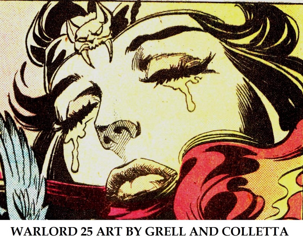
WARLORD 25 ART BY MIKE GRELL AND VINCE COLLETTA

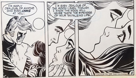
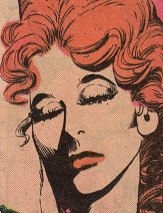
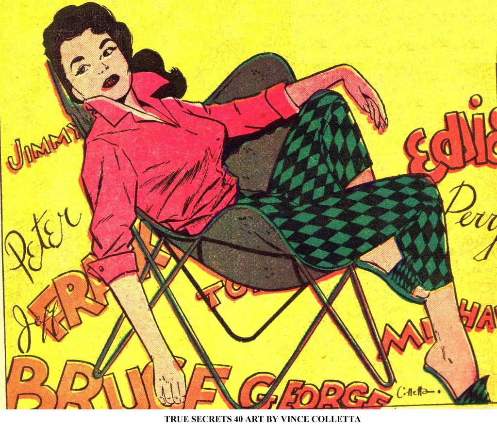
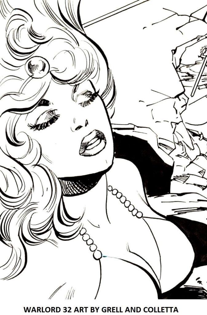
The immense body of art work illustrated by Vince Colletta presents me with a marvelous window into the creativity of the man. From the 50s, during which time he penciled and exquisitely inked primarily romance stories, to the birth and successful  emergence of superheroes that continues today. Here are a few examples from the book “DRAWN TO BEAUTY, VINCE COLLETTA – LIFE AND ART” which, by the way, is a must read not only for those who love comic book art and publishing lore, but also to examine the incredible tale of a life that, in ways that will surprise you, has become even more fascinating since he died in 1991. Vinnie’s women usually had sumptuous lips and that famously substantial mascara. Reader’s comments over the years have been…. interesting.

Andrew Wahl: Personally, I don’t put much of Vince Colletta’s inking in the “beauty” category. But I am trying to keep an open mind as I revisit my old comics for these reviews, and judge each book with a fresh set of eyes. That’s why I’ve been surprised to find Colletta’s work on Warlord better than I remember. This issue is a good example: I typically like Bruce Patterson’s inks, but didn’t find them to be an improvement over Colletta’s work on the title.

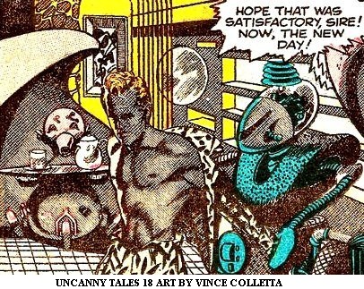
Ben Herman: For something that was inked by Vince Colletta (Warlord,) this actually looks pretty good. Maybe it was the fact that Shakira, a sexy lady clad in a fur bikini, was in pretty much every single panel of the story motivated Colletta to put in a little bit more effort that usual? Whenever there happened to be a beautiful woman in whatever he happened to be inking, suddenly Colletta always seemed inspired to do just a little bit more work than he usually would.

Colletta-inking-techniques
ROMANCE ART BY VINCE COLLETTA

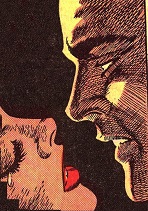
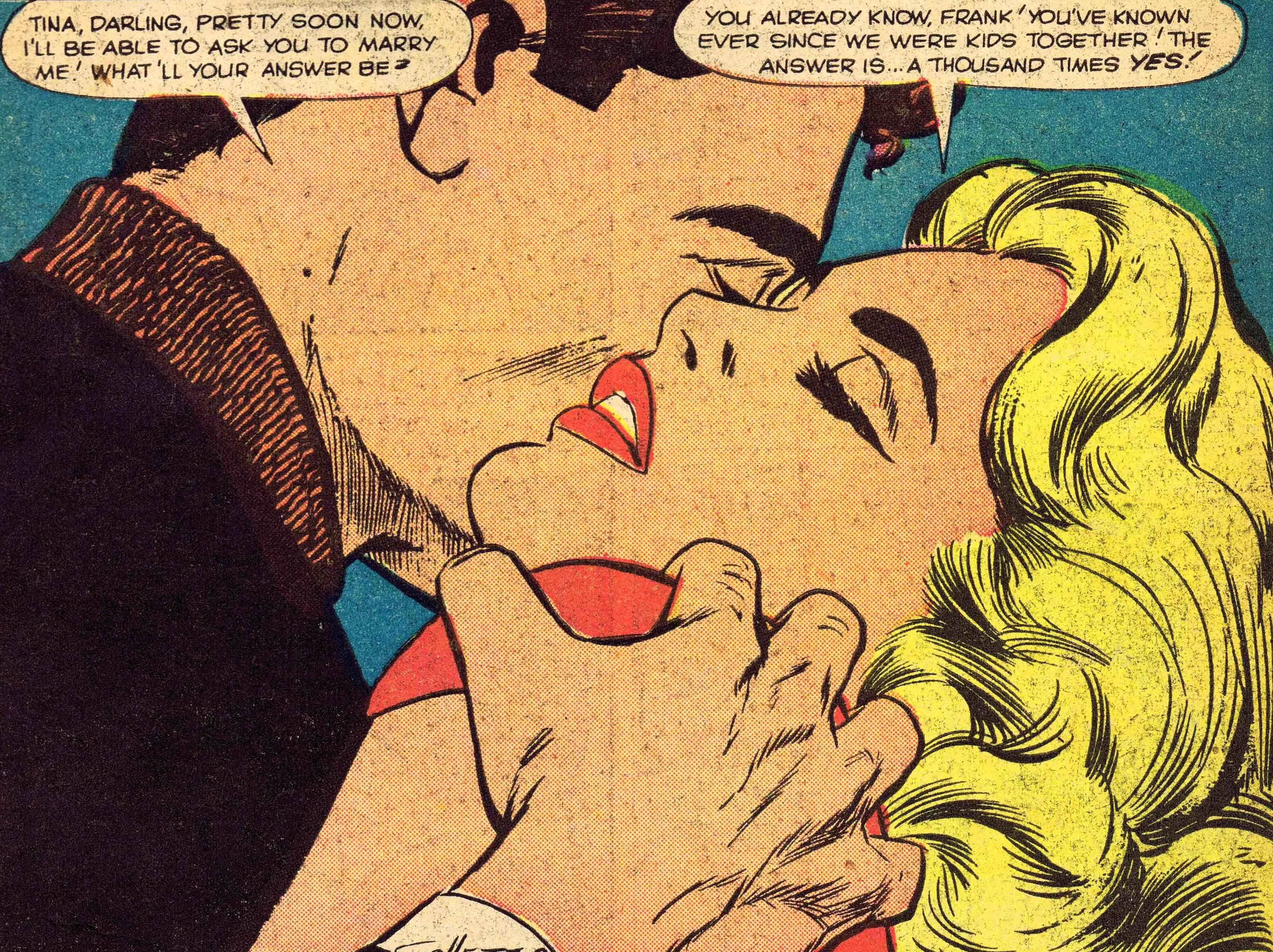
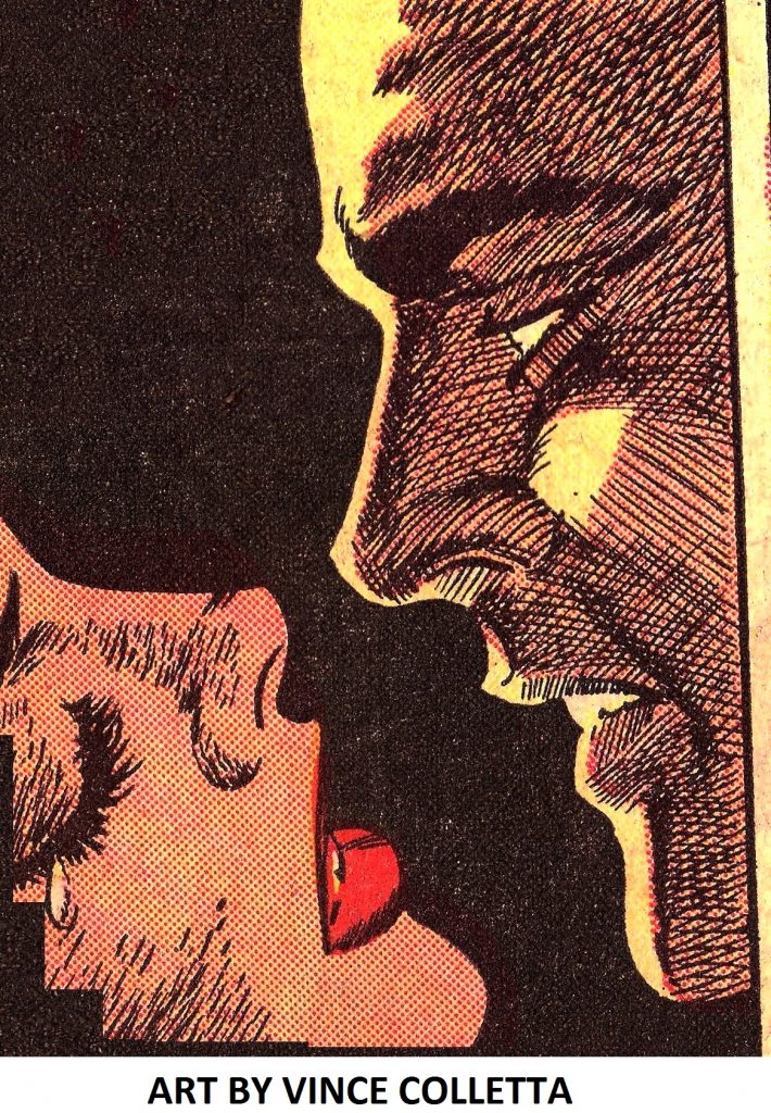
Graduating diamond shapes created by cross-hatching at different angles, embellished with shadows and light contrast a glow radiating from the man’s cheeks. It is he who dominates the panel. The woman, of course, is beautiful with subtle accent lines in her lips.

Mike Browning: Hmmm … while we’re on the topic of artists who don’t make the hot list each month … Win Mortimer’s Spidey Super Stories art is classic and Vince Colletta’s romance stuff was beautiful.

Ken Allan: without starting any sort of a flame war, can anyone send me any articles, personal experiences, etc. with regards to Vince Colletta? I seriously want to just learn a bit more about him and have had little success. Even if some of you could point me towards any interviews he may have done,….ANYTHING,…it would be deeply appreciated.

David Edge: Vince Colletta would have best served Kirby in the 1950s, when he seemed to take greater care in his artwork. As I’ve said before, his romance art from this time was truly stunning.

Mark Yanko: Vinnie is a bit like Don Heck in that respect. If you look at early romance art by Heck and compare it to his ’70s superhero work, the difference is startling.

Mike Pascal: Right on, Mark. Thanks to John Lustig’s wonderful LAST KISS strips, Vinnie’s lovely romance work is on display almost weekly and will be preserved for a whole new audience.

Colleen: Vinnie Colletta used to freak me out because all the women he inked had the same gloppy mascara.

Colletta shadows
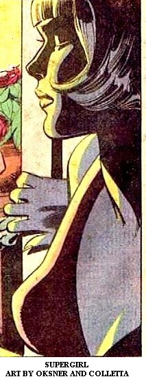
OKSNER AND COLLETTA

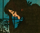
The central character in the panel is obviously the girl but she is rendered darkly with complex facial shading accompanying the simple shadowing of her neck and breast. The inversion of color in the girl’s left eye is interesting, almost seeming as if her eye is closed. I love how the inker featured luminescent highlights in the girl’s hair. Bob Oksner was an excellent plotter of all types of stories.

Droid714:  As I’ve stated before, since I was a Marvel Zombie from the very early 60’s through the mid 70’s, I completely missed Vinnie’s work at DC in the 70’s. Now that I’m going back and collecting Wonder Woman and Supergirl from that era, I’m seeing much of his DC work for the first time. And the more I see of it, the more I like it. In my opinion, he was a much better technical artist than Kirby. His women actually looked like women, not men with long hair. And quite frankly, I’ve never been a big fan of Colan or Buscema.

Again, the more I see of Vinnie’s work, the more I start to wonder if a lot of the negativity that some of his peers allegedly felt for him wasn’t motivated a little bit by jealousy. He was good, he was fast and he occasionally erased a few lines of their precious pencils. Yet without Vinnie making sure the work got out the door on time, how many of them would have been whining about missing their paychecks?

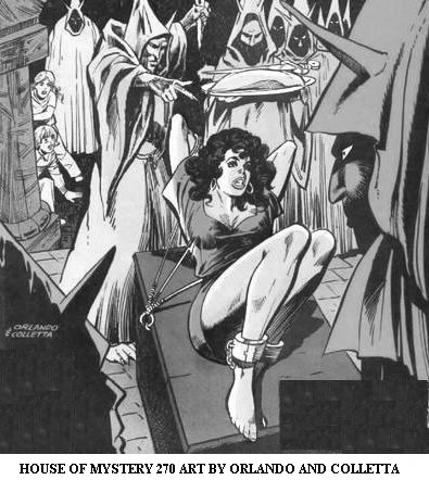
Bondage and Druids Grayscale
HOUSE OF MYSTERY 270 ART BY ORLANDO AND COLLETTA
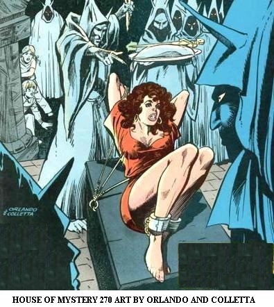
Bondage and Druids Color
HOUSE OF MYSTERY 270 ART BY ORLANDO AND COLLETTA

The colorist Tatjana Wood helped to bring out the darkness of both the scene and the girl’s horrific situation with her vivid coloring of the damsel in distress. Joe Orlando was a terrific penciler for laying out macabre stories. Vinnie’s inks on the captive woman are incredible showing her virtually bursting out of her dress in an effort to escape.The druid in the foreground is ominously inked with a bold brush and pen; the others rendered more delicately as are the shocked children who look on from the background. Vinnie and Joe were very close friends throughout their forty-year professional careers.

Fat Boy: When I first saw these Joe Orlando and Vinnie Colletta Daredevils it seemed like art art instead of just comic art. Hopefully you’ll post some scans of the interior pages. Sure wish I had saved these.

Comicsdad: Joe Orlando’s art is quite nice, and I can’t remember when I’ve seen Colletta’s inks reproduced so well

Joseph Graves: I thought it was strange Vinnie put as much into that over Orlando whose art is cartoonish. I liked it.

Nick Caputo: I agree for the most part, although those early DD’s by Orlando had a certain charm to them. I even liked the Colletta inks, go figure!

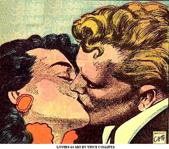
Vince Colletta Illustrative Comic Book Art
LOVERS 64 – NOVEMBER 1954

Despite the poor print quality of comic books in the 1950s, some artists, Colletta among them, strove to impart an illustrative, portrait-like quality to their art. This splash page represents the finest efforts of Vince Colletta to translate his love of oil painting onto a completely different, difficult medium. An artist can create lifelike people in a realistic world using oils. Museums are full of such masterpieces. The same techniques and the resultant works are literally impossible to duplicate with pencils and ink. I believe this example is as close as you will find in a comic book.

Mr. Peabody: Not much to say about the inking on the cover but the interior page you showed looks pretty good to me. It is just romance, after all, and I doubt if either of the men who created this artwork were trying for a museum piece. Anyway, there’s no way Colletta could have turned one of these rounded faced Kirby women into a something either realistic or beautiful. See the cover of Lovers #64 or most any other Vinnie girl from the 50s to illustrate my point.

Walt: I enjoy fine line work as done by the likes of Reed Crandall, Al Williamson, Vince Colletta etc and sorely miss this highly detail efforts of illustration as the today’s stock or printing processes do not allow this type of illustration.

alexarcadian: It’s apparent if you go back and look at Colletta’s romance work from the 50s he was aiming for an illustrative look something along the lines of Leonard Starr.

Russ M: The thing about Vince Colletta is what this book (The Thin Black Line) missed altogether and that’s his art. When given time, Colletta outshone every other inker on superheroes. Prior to that he drew hot romance stories that looked a lot more realistic than what other artists were doing. Just look at the cover of THOR #126 – could that finished product been equaled by anyone else. Even to this day, inkers use thick black lines that look almost measured as if by rulers and protractors. Colletta took pen in hand and illustrated, drawing shadows, depth and realism into his subjects.

Ger Apelde: But some artists, such as Colletta and Al Williamson (and most of his group of peers) liked to experiment. You see them try out new techniques in every panel. They use dry brush, full brush, pen, stencils, anything. Colletta’s early work is very similar to that, but he adds a twist of his own. He frequently uses patterns to distinguish one material from another. At times it’s almost as if he is a fashion illustrator. That, combined with his way with pretty women, made him very suitable for romance comics. He also developed a great way of drawing women’s hair, which is not something every artist masters.

Bring Back Zot: Nice article and an even nicer drawing of Vince Colletta, Michael. Love him or hate him, those 50’s covers prove Colletta had genuine artistic talent.

Michael Netzer (Former Marvel and DC Penciler): How true, BBZ. Vinnie’s romance work is not only indicative of talent, but stands along side some of the best in commercial illustration, like Stan Drake and other giants of his time.

Index of articles www.vincecolletta.com