This is my take on the subject of this classic cover, Thor #134, pencils by Jack Kirby, inks by Vince Colletta, colors attributed to Marie Severin and, of course, a small witticism from Stan Lee in the lower blurb.
Recently posted elsewhere was the brilliant cover of Marvel’s THOR #134 which invited a second glance.
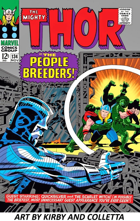
There’s a strong case for calling this cover a masterclass in classic superhero comic design. A lot of what I respond to comes from how many visual jobs it does at once without feeling crowded.
What makes it feel so powerful is also something which may well have been omitted, IMO – that giant white ring which is doing enormous compositional work—it separates foreground and background while directing our attention into the scene.
Jack’s powerful layout and elaborate mechanical design is extraordinary. I often wondered what would compel an inker to want to work over Kirby’s indefatigable pencils. – more than once, anyway. The metallic blue villain in the foreground anchors the left side. The circular framing device acts like a window into the action and THOR bursts outward from the glowing center. The blue villain against the warm orange burst is especially striking. For all of it’s intricacies, the composition is exceptionally controlled.
This is a cover built by people who understood that comic art had to grab a kid from six feet away on a spinner rack and still reward close inspection. That’s a difficult design problem, and this art team solves it beautifully.
The inking is doing heavy lifting in this cover. The linework has that dense, confident mid-1960s Marvel feel such as thick silhouette lines and bold contouring. Colletta combined both graphic and illustrative touches to create a slick, futuristic character and scene being invaded by a warrior from Norse times. The rendering on Thor is noticeably different from the heavy, graphic treatment elsewhere. Vince uses fine feathering and selective contour modeling on Thor’s arms rather than thick shadow masses, which gives him a sculptural, heroic presence. The villain gets graphic treatment; the hero gets classical treatment. The metallic foreground figure is built from hard blacks, sharp contour lines, and mechanical patterning — cold, rigid, inhuman. Thor, by contrast, is organic and softly rendered. The stylistic opposition reinforces the story psychologically. The delicate rendering creates hierarchy. Thor becomes the visual “human center” despite not being the largest element. Your eye lands on him because the treatment is more nuanced and alive. This is one of those underrated skills of classic comic inkers: knowing when not to overpower the pencils. The best inkers weren’t just tracing—they were making aesthetic decisions about materials. Metal gets one treatment. Flesh gets another. That tension—graphic abstraction vs. anatomical delicacy—is a big reason the cover feels richer than a lot of contemporary superhero art. This cover clearly works as design, storytelling, and mood. People have been staring at it for decades for a reason.