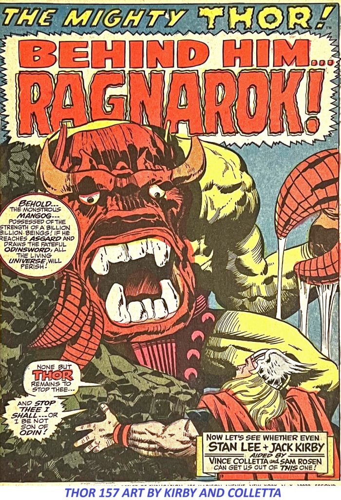
There will probably never be a definitive answer to that question because the debate over Vince Colletta’s inking of Jack Kirby on THOR has been going on for decades.
Some Kirby fans prefer Kirby’s pencils without Colletta’s interpretation. Others believe that Colletta’s delicate lines, textures and unusual approach gave Kirby’s Asgard exactly the atmosphere it needed.
I am firmly in the second camp.
The Great Kirby-Colletta THOR Debate
A recent discussion in a Marvel Splash Page Facebook group brought the old argument back to life.
Steven Pavia:
“Too bad Vinnie inked those early Thor’s…I would have loved to see what Joe S. could’ve done.”
That’s a perfectly legitimate artistic opinion.
But then came a response that gets much closer to the reason I believe the Kirby-Colletta THOR pages work so extraordinarily well.
Michael T. Gaffey:
“Colletta gave Kirby’s depictions of Thor’s Asgard a gritty, earthy feel – a dimension of frightening creatures and savage combat. He was perfect for the title. Sinnott would have made everything shiny and bright. He was better suited for FF with its gleaming machines.”
Exactly.
That is the distinction.
The question isn’t simply whether another inker could have produced beautiful artwork over Kirby’s pencils.
Of course one could.
The question is whether another inker would have produced this particular THOR.
Jack Kirby Created the World. Vince Colletta Helped Define Its Atmosphere.
Jack Kirby’s contribution to THOR is beyond dispute. Marvel’s own issue records credit Kirby as penciler and Vince Colletta as inker on numerous issues during the classic period.
But comic-book art is a collaboration.
Kirby’s pencils supplied the architecture: the monumental figures, impossible machinery, wild anatomy, explosive action and extraordinary compositions.
The inker had to interpret those pencils for reproduction.
And Colletta brought something very different to the job.
His lines could be delicate.
They could be almost illustrative.
He could use fine detail, texture and cross-hatching to give figures and environments an old-world quality.
That quality was particularly appropriate for Asgard.
The result was not merely a superhero comic dressed up with Norse mythology.
It felt like another world.
Why Colletta’s Style Worked on Asgard
One of the most interesting things about the Kirby-Colletta collaboration is the contrast between Kirby’s monumental designs and Colletta’s more delicate rendering.
Kirby could make Thor look enormous.
Colletta could make him look ancient.
Kirby could create a monstrous creature.
Colletta could make that creature feel mythological.
Kirby could design a spectacular Asgardian landscape.
Colletta could give it the atmosphere of something that might have appeared in an old illustrated legend.
That combination is what makes the best Kirby-Colletta THOR pages so distinctive.
The Vince Colletta Archive has discussed the distinctive quality of Colletta’s work on THOR and Tales of Asgard.
And that’s the point that gets lost when the discussion is reduced to whether Colletta was a “good” or “bad” inker.
He was different.
And sometimes different is exactly what a particular character or world requires.
Joe Sinnott Would Have Been Beautiful — But Would It Have Been the Same THOR?
This is where the criticism becomes interesting.
Joe Sinnott was an exceptional inker.
There is no argument there.
But imagine the classic Kirby THOR pages inked in the highly polished, clean and luminous style associated with Sinnott.
Would they have been beautiful?
Absolutely.
Would they have been the same?
I don’t think so.
The Fantastic Four provides a useful comparison.
Sinnott’s polished approach was perfectly suited to the technological, sophisticated world of the Fantastic Four — the gleaming machinery, clean surfaces and futuristic environments that were such an important part of that series.
Asgard required something else.
It needed age.
It needed texture.
It needed mythology.
It needed a world that could feel simultaneously magnificent and dangerous.
And Colletta’s line could provide that.
The “Gritty, Earthy” Quality of Kirby-Colletta THOR
That’s why I keep coming back to Michael T. Gaffey’s description of Colletta’s Asgard as having a “gritty, earthy feel.”
It’s an excellent observation.
Look closely at the best Kirby-Colletta pages.
The gods aren’t merely superheroes.
They look like warriors from an ancient civilization.
The creatures aren’t simply monsters.
They look savage.
The architecture isn’t merely background decoration.
It feels old.
The combat isn’t clean.
It feels brutal.
There is a physicality to the figures that can be easy to overlook when the conversation becomes consumed by the question of whether Colletta “simplified” Kirby’s pencils.
Some critics understandably prefer the detail and energy visible in Kirby’s pencils.
But the finished comic-book page is not the pencil page.
It is the result of a production process involving pencils, inks, lettering, coloring, printing and reproduction.
And Colletta’s contribution became part of the visual identity of classic THOR.
Colletta’s THOR Wasn’t an Accident
This wasn’t simply a random pairing of an inker and a penciler.
The collaboration developed during an important period in the evolution of Thor and Asgard.
The Tales of Asgard stories were particularly important to that development.
Marvel’s issue credits demonstrate how substantial Colletta’s contribution became. He was not simply an occasional visitor to the title. He was the credited inker on a substantial run of Kirby’s THOR work.
That matters.
Because whatever one’s personal preference may be,
Kirby and Colletta created a recognizable visual language together.
You Don’t Have to Prefer Colletta
There is no requirement that everyone like Vince Colletta’s inks.
If someone prefers Jack Kirby inked by Joe Sinnott, Mike Royer, Chic Stone or Kirby himself, that’s a perfectly reasonable artistic preference.
Art isn’t a mathematical equation.
But I do think it is worth looking at the work on its own terms.
Instead of asking:
“Why didn’t Colletta ink Kirby the way I wanted Kirby to look?”
perhaps the more interesting question is:
“What did Colletta bring to Kirby’s THOR that another inker might not have brought?”
The answer is atmosphere.
He brought texture.
He brought an old-world quality.
He brought a certain delicacy to some extraordinarily powerful figures.
And, perhaps most importantly, he helped make Asgard feel like Asgard.
The Kirby-Colletta THOR Legacy
The continuing argument over Vince Colletta’s THOR inks is actually evidence of how memorable the work became.
Nobody spends decades arguing about artwork that made no impression.
The Kirby-Colletta pages remain recognizable because the collaboration produced something visually distinctive.
For me, the answer is visible on the page.
Look again at that splash.
Look at the figures.
Look at the textures.
Look at the creatures.
Look at the atmosphere.
Look at the sheer physical presence of the characters.
Then ask yourself the original question:
How is it possible to look at this Kirby-Colletta THOR and say that Vince Colletta ruined it?
I still don’t have an answer.
And maybe that’s okay.
Some arguments are worth having precisely because the artwork is good enough to keep the argument alive.
For more articles about Vince Colletta, Jack Kirby, THOR, Tales of Asgard and Colletta’s work in comic-book history, explore the other articles and artwork at VINCECOLLETTA.COM

Recommended SEO settings